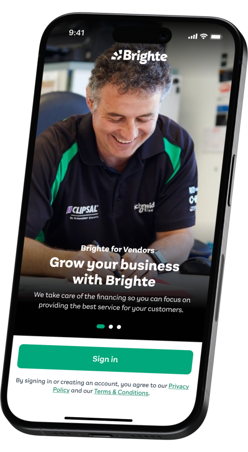
Brighte vendor app
An iOS and Android app for the Brighte partner network – receive leads, apply for finance and track applications.
About
Facing challenges with maintenance, Brighte wanted to create a whole new Vendor App by moving their legacy apps on PhoneGap over to React Native and GraphQL.
Responsibilities
UX Design, UI Design, UX Writing
Tools
Figma
Brighte, an Australian fintech, is reshaping the home energy landscape by facilitating finance for solar and battery systems. The vendor app is used by over 2,200 accredited tradies, streamlining finance applications for new customers.
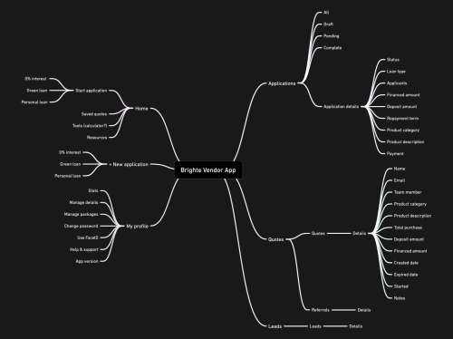
Contexting up
Conducted a comprehensive audit of the existing vendor app’s UX, gathered existing public and internal customer feedback.
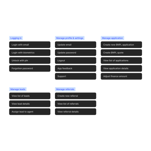
Activity map
Created an activity map which scoped out the project and was used as the roadmap to guide the design and development.
Wireframes
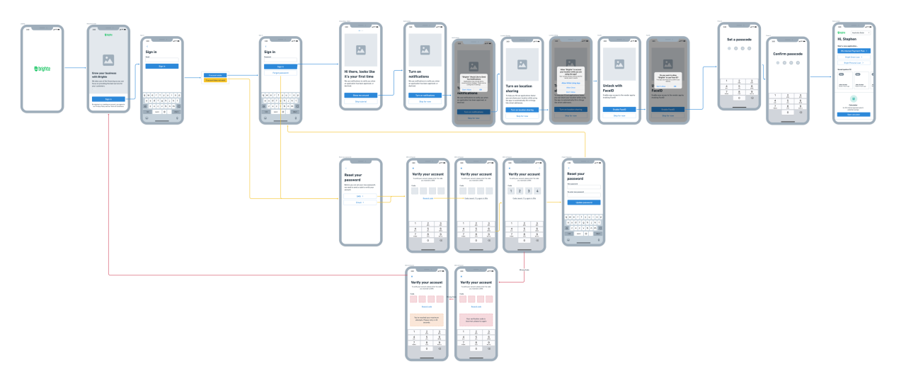
Designed low-fidelity wireframes of each user task to ensure regulatory compliance. These blueprints were then used to create dynamic prototypes, setting the stage for user testing and refining the design.

User testing
Prepared a research plan and conducted moderated usability testing on the prototypes with a cohort of existing users. Synthesised and actioned insights from the sessions.
Interface Design
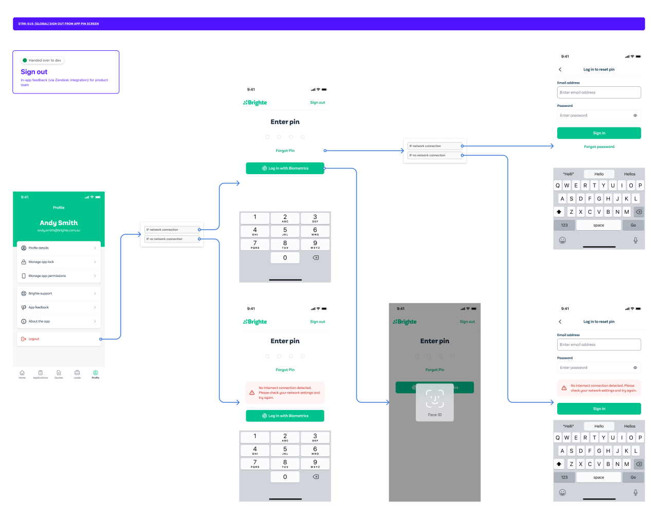
Developed high-fidelity user flows with impeccable Figma hygiene, including clear annotations of conditional logic. Held regular syncs with the development team to review user flows and ticket up completed design work.
Notable features
Onboarding
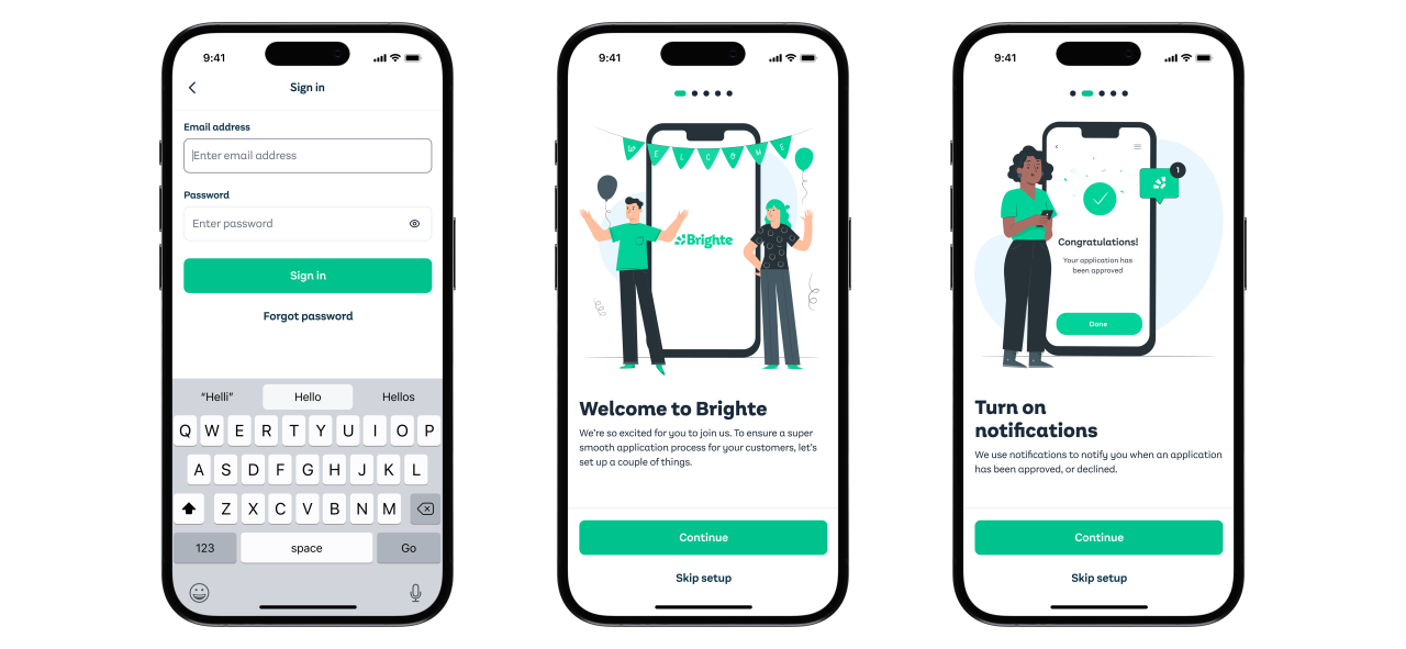
While a mobile app typically requests permissions ‘in-context’ – the app's ‘in-context’ moment occurs when an end customer, not the device owner, is holding the phone. To ensure a smooth application process, the setup of device permissions was integrated into the onboarding flow.
Applying for finance
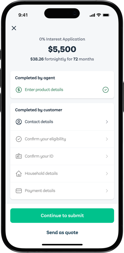
The new application flow halved the time it took user’s to fill out their details and apply.
Capturing feedback
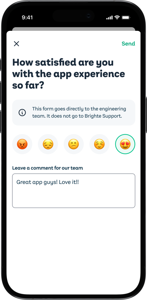
Brighte's existing support platform, Zendesk, and in-context CSAT surveys were integrated into the app before production launch.
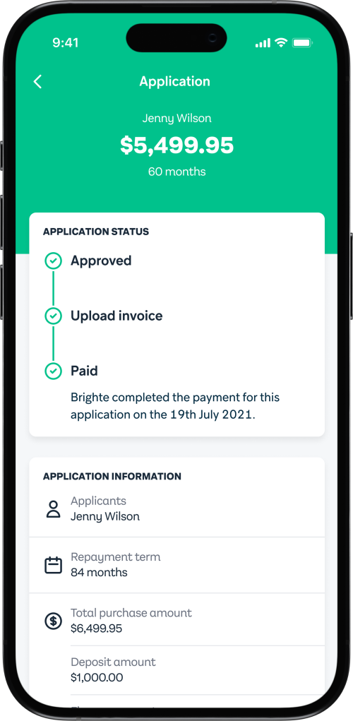
Track applications
Vendor’s can quickly check an application’s status with the status tracker.
Design system
A Figma UI kit and a React Native library of over 24 components. Each component had its own documented guidelines and matched the React Native API spec.


Closed Beta Launch
Launched a closed beta, onboarding existing vendors onto Testflight and Play Console. Actively synthesized and acted upon feedback, making iterative improvements based on real-world usage.
Production Launch
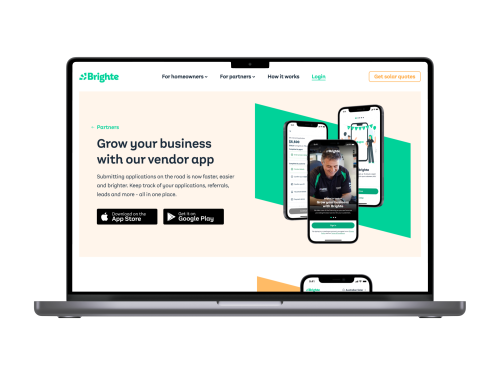
Multichannel Rollout
Prepared a visually engaging landing page design for the website, leveraging React components. Expanded the launch across social platforms, blog posts, and tutorial videos.
App support
Created a suite of tutorial videos, promotional content, and internal guides to facilitate user adoption and understanding.
The Outcomes
Tech evolution
Brighte vendors seamlessly transitioned to a new Android and iOS experience, powered by React Native and GraphQL.
Streamlined processes
Redesigned the finance application process, reducing the time required from 12 to 5 minutes with most customers receiving an outcome within 30 seconds.
Product momentum
Created a robust React Native design system which became a launching pad for future mobile app projects such as Brighte’s consumer app.