Events OnAir
A platform enabling thousands of event planners to pivot their in-person event to a ‘COVID Safe’ online experience.
About
As the only designer on the project team, my role was to lead the design effort from start to finish and collaborate with a remote team of developers and product managers.
Responsibilities
UX Design, UI Design, UX Writing
Tools
Figma
Days before a national lockdown, Event planning platform EventsAir was facing the prospect of losing their entire user base as events were being cancelled across the world.
We had one month to design, develop and deliver a brand-new platform for users from scratch.
In order to give the developers enough time to develop and launch the product, I knew they had to start tooling right away. We scoped out 10 days of design.
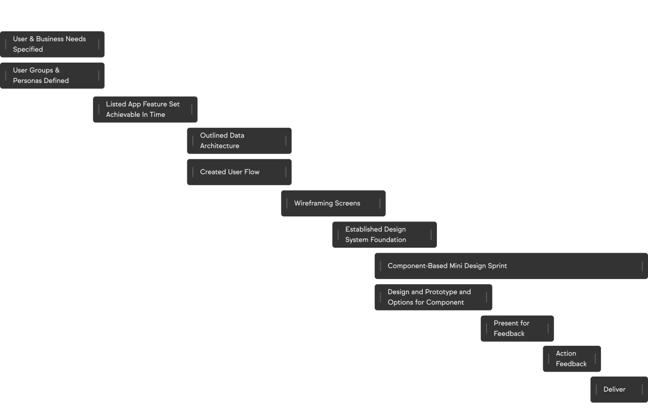
Zoom meetings with company stakeholders quickly established the strategy and scope of the app. After which, I established the foundation of the design system and we got started - working component by component.
Project Process
Once the scope and structure of the application was defined with the team, I divided each component into its own design sprint. Multiple solutions were designed for each component, and I would prototype how these components would function, followed by a presentation to the team. The team would decide collectively on the most promising solution for the component. I promptly addressed any feedback, and the components moved to development for internal testing. Any issues discovered during internal testing prompted further design iterations.
User Groups

The Event Planner
As an event planner, I want people to have a great time so that they come back next year.

The Event Sponsor/Exhibitor
As an exhibitor, I want to meet prospective customers so that I raise brand awareness and win some work.

The Event Attendee
As an event attendee, I want meet new people and hear new ideas so that I can be better in my role at work and grow my career.

The Event Speaker
As a speaker, I want a smooth presentation so that I can focus on my talk and leave a good impression, without worrying about the technical details.
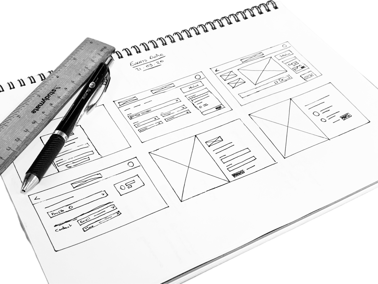
Wireframes
Design system
The design system is a strict 4px grid system with a robust type system and colour palette.
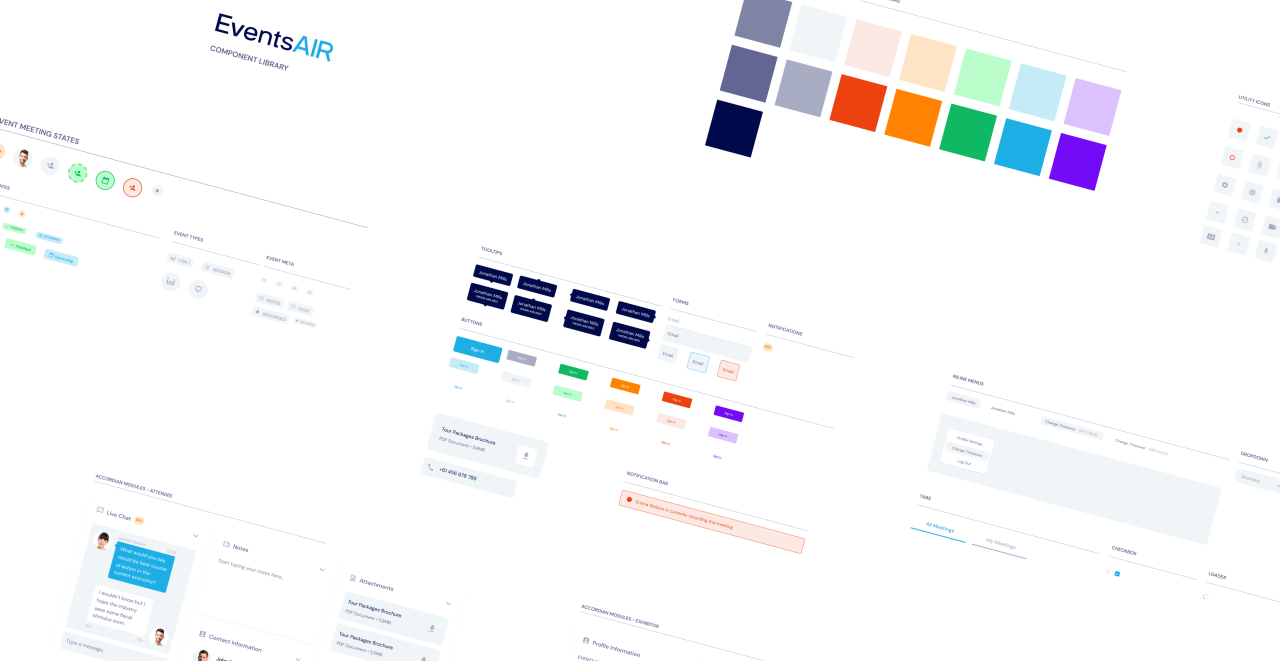
Event Types & States

Meeting

Presentation

Function

Upcoming

Live Now

Finished
Communication
I recorded daily walkthroughs of the design and distributed the video throughout the team so that everyone was up to speed on the design thinking and where the designs were at.

Features
Onboarding
Every event planner is eager for their attendee to have a great experience. We wanted to ensure that the first touch points of the product didn’t let our event planners down. So we designed a sign in and permission screen with a large space for branded content. Video conferencing applications need a lot of permissions from either the device or the browser, I designed a permission wizard to help ease the anxiety of handing over permissions to the platform.
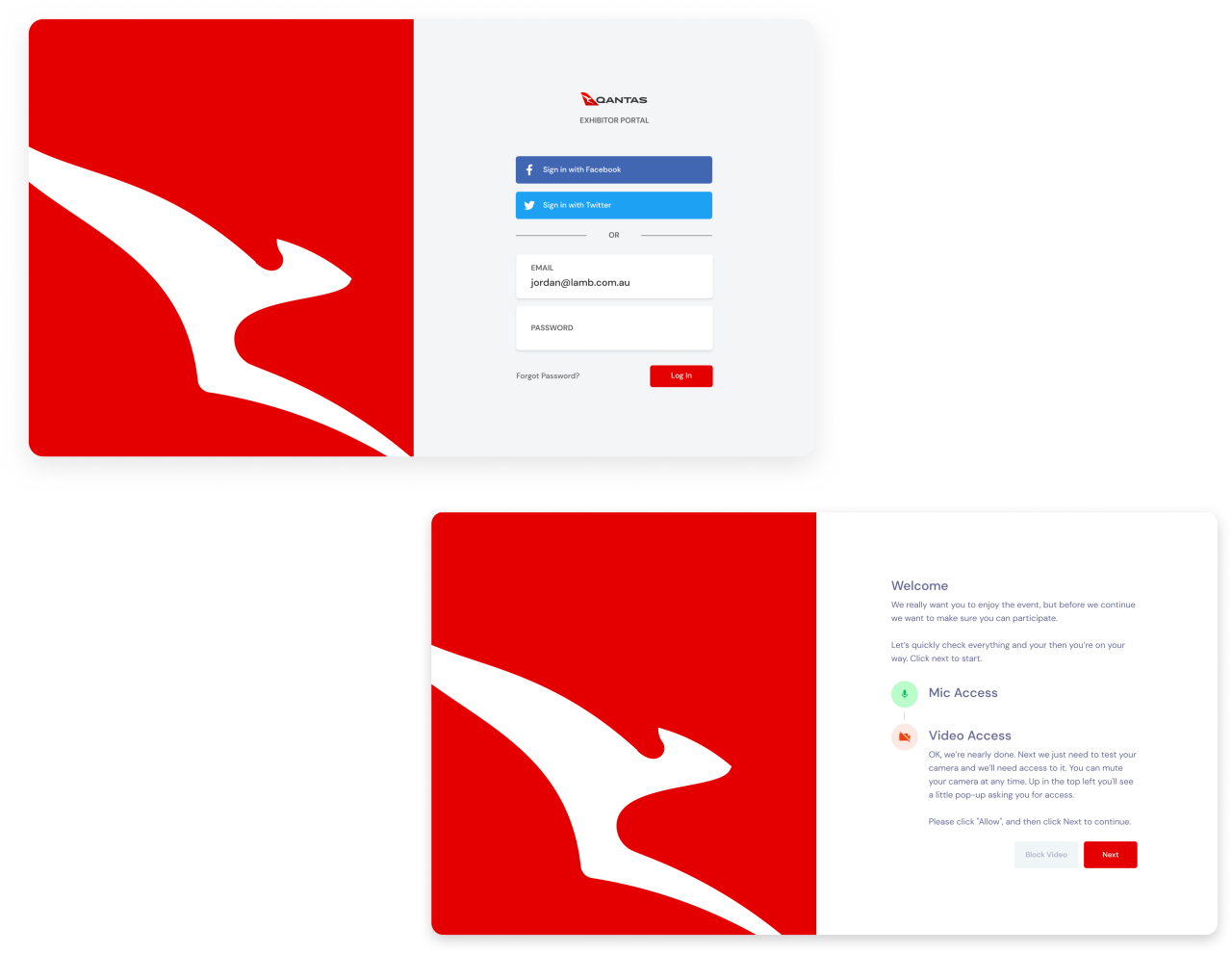
Login screen and permission wizard for a Qantas event.
The dashboard
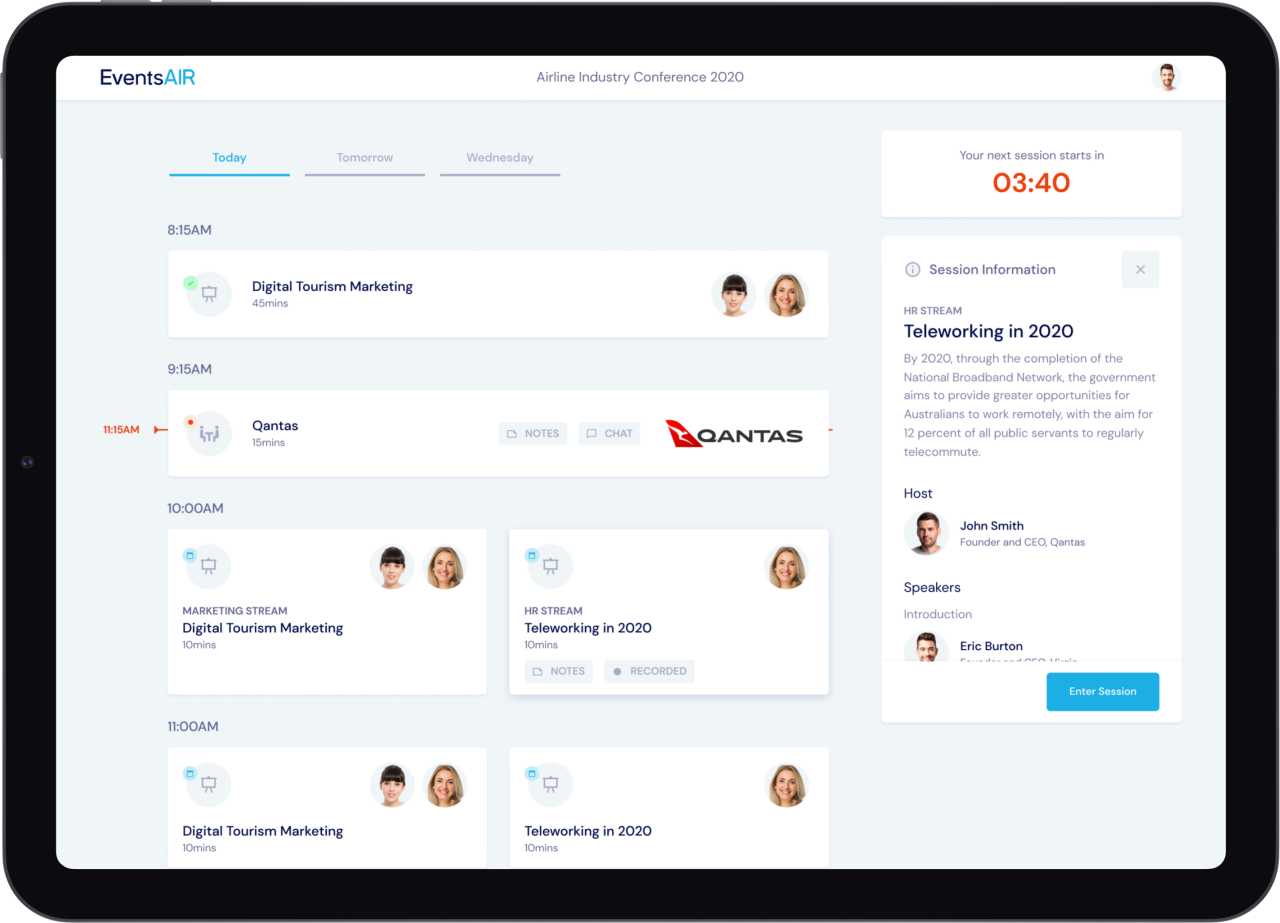
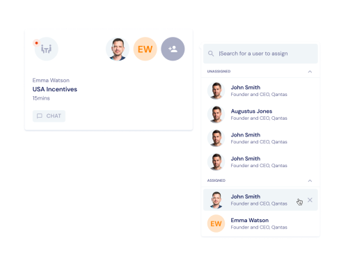
Quickly Assign Co-Workers to Meetings
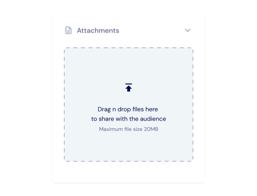
File Upload
The Event Screen
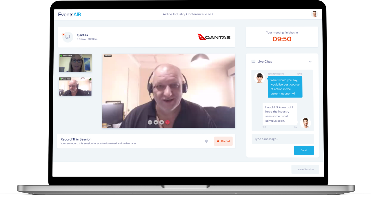
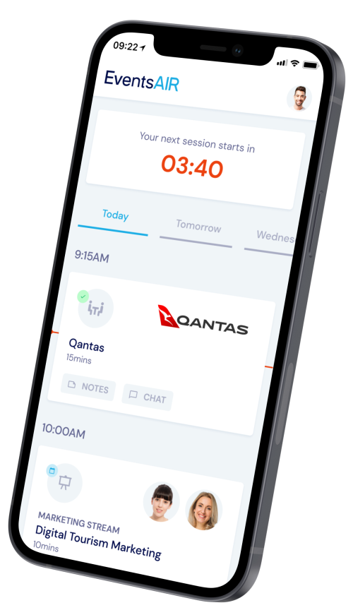
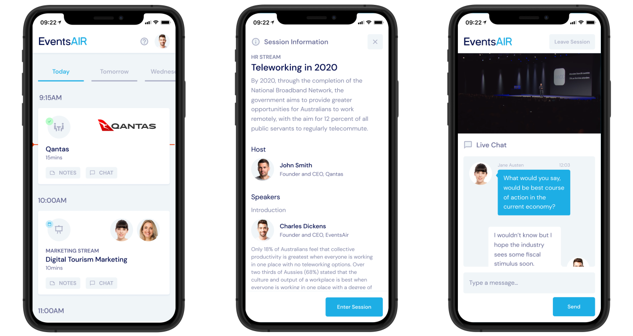
Mobile App Flow
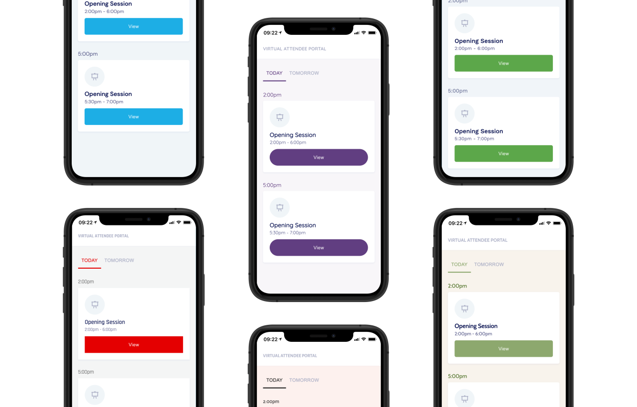
Theming Engine for Branded Experiences
The event planner has the freedom to define a brand colours, fonts and button styles.

Accessibility
The entire app was audited to ensure all use of colours was AA compliant and that components retained their keyboard accessibility.
Recognition

